When we decided it was time to farewell APHS as our business identity, there was only ever one name considered.
Our core values, Energy, Purpose, Innovate and Connect are at the heart of everything we do. Over the last five years we’ve seen them evolve into a broader range of Epic programs that recognise the amazing engagement of our teams.
We have our Epic rewards and recognition program and our annual peer-nominated Epic awards which see hundreds of submissions each year by people keen to acknowledge their colleagues’ contributions. Taking this deeply embedded representation of our culture to the broader external audience was not only a logical step, but one that we couldn’t go past.
We’ve had the best time planning our launch…
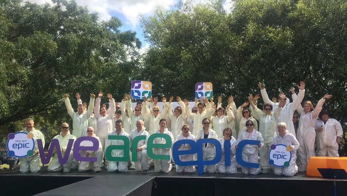
From the activities that occurred at the Powerhouse in Brisbane:
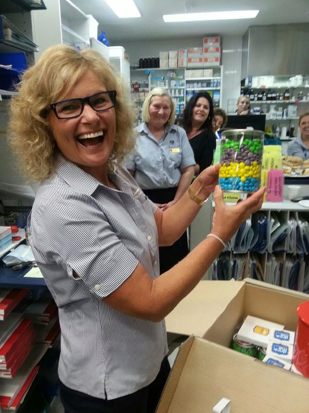
To the boxes full of Epic branded goodies delivered to each site (closely guarded until today’s big reveal before they could be opened):

To working with Mediavisionz on the creation of our animated announcement piece:
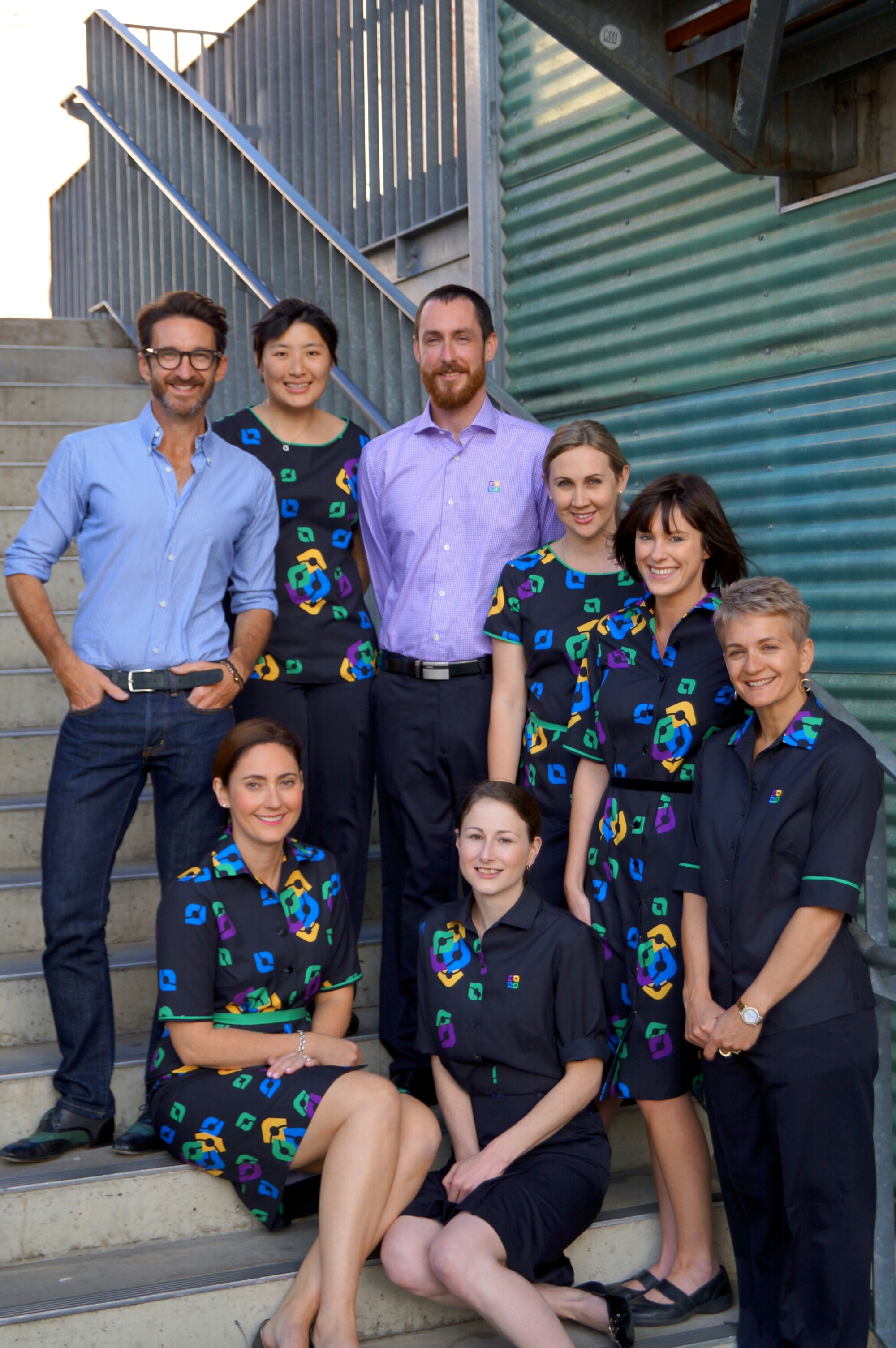
And, of course, our uniform collaboration with Paul Hunt:

When Stuart and I detonated the pyrotechnics (never have I felt more like the Road Runner in my life) to reveal the Epic name and logo, the crowd gave a huge cheer that told us they couldn’t have been happier with the long awaited announcement. As feedback from the sites around the country started coming in soon after the announcement, it became apparent they were equally thrilled with their new identity.
There was never any option but Epic. It’s already a part of our DNA. The launch was about telling the rest of the world and inviting them to join us on our next adventure.

If you want to see some more of the days highlights, including the obstacle course, the paint cannons, the models arriving on Segways and all the fun in between, you can check it out here!
